Thursday 28 February 2013

drafting digi paks

This is the digipak layout I will be using and have started to make rough drafts for it playing around with fonts and colours for the front and back pages using photoshop. 
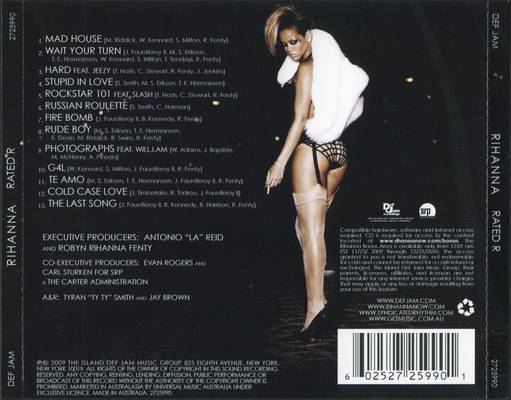
I have been changing the font and colours of the font for the back page of the album which displays the albums content, I have noticed that on the back barcodes are used as well as record label icons are displayed.
I have decided to use the read Teash font for my artists title and album title, When I add images of the artist to the drafts I am going to move the title around to see which looks best. I have noticed that in many famous artists albums, there name is clearly printed across an image and is the main feature, I believe this looks effective and I am going to try it for my own.
This draft is to show my digipak improving along the way through using photoshop. I hope to establish a set of images that all look like they belong and relate to my music video as well as represent the artists image in the correct light. I think I am going to use the house colours of red black and grey, however I may have to change this as my images of my artist are mainly black and white and this might effect the house colours. The main cover image will be a medium close up of my artist, and the to flaps will have a long shot of my artist. 


Wednesday 27 February 2013

Record Label

I noticed that many record labels have simple logos, mainly because the logo is featured as a small image on the CD or DVD cover.
for example through my research I found these: 


 Here on the back of Rihanna's album cover, you can see the small logo just above the paragraph of writing above the barcode on the right hand side. 


Looking at exisiting logos made me create my own to look like this: 


Monday 18 February 2013

Magazine Poster Research

Examples I have found from existing similar artists:
A simple yet powerful magazine advert from Beyonce, because she is so well known worldwide strong images can be used. No description is given. 

This advertisement from The Vaccines uses the album name which is actually a question to question the audience through the poster, very cleverly played with through advertisement. It uses the conventions of the release date been shown, quotes from music magazines and star ratings of the album from well known respected sources. The 'play.com' icon is used in the right hand side to show where the album is available from and the album itself is displayed in a small image on the left hand side, a very typical convention expected to be used in an album advert. 

This Marina and The Diamonds advert from a magazine uses the same recognizable font throughout, such as the same font for her name and song title. It is a simple advert that portrays Marina's face across and the actual picture of the album. It simply states 'available on itunes' but goes against expected conventions and doesn't use the itunes icon. 

This advert for Ellie Goulding, uses conventions of the artists name and album title placed center fold of the advert for the audience to be able to clearly read and has reviews and quotes about the album from other music magazines. Her face is the main feature of the advert, with added adjustments to her hair to fit in with the theme of 'lights' for her album title, it is simple yet effective. 

Florence and the Machine use her album image for the advert and just add extra conventional details to the advert such as dates, featured songs and different forms in which the album can be purchased. This is a good way to advertise the album as it is recognizable through using the same fonts and images.

The artist's face is a clear dominant image, using the same familiar font for her name which features on the album itself, a record label logo is seen, shows featured songs. Uses all the expected conventions for a magazine advert. 


Wednesday 6 February 2013

fonts

Here I have been demonstrating with different font styles for my artists name. It is important to chose a font that fits in with the artists personality, as my artist is quite 'fiery' but also is seen to have a sensitive side in her song, I want a hard font with a subtle soft side. My favorites here are the red and purple fonts. 

I have looked at a different range of fonts for the song track title, I think I am going to choose one from the first 2 lines. I like that they are in capital letters and simple state, I don't believe the script font titles fit into the song title and overall theme of my artist.